

UPS
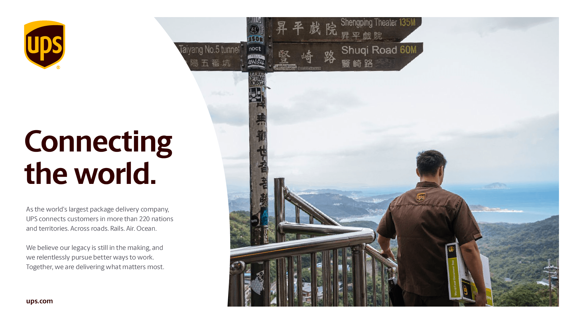
UPS is currently undergoing a transformation, which will lead to a more modern and agile organization. A part of this transformation means modernizing the visual identity to get noticed and become a part of the cultural conversation. In close partnership with the UPS creative team, we were tasked with taking this celebrated and globally-recognized brand and help codify this new aspiration and drive consistency across any and all touchpoints and countries.
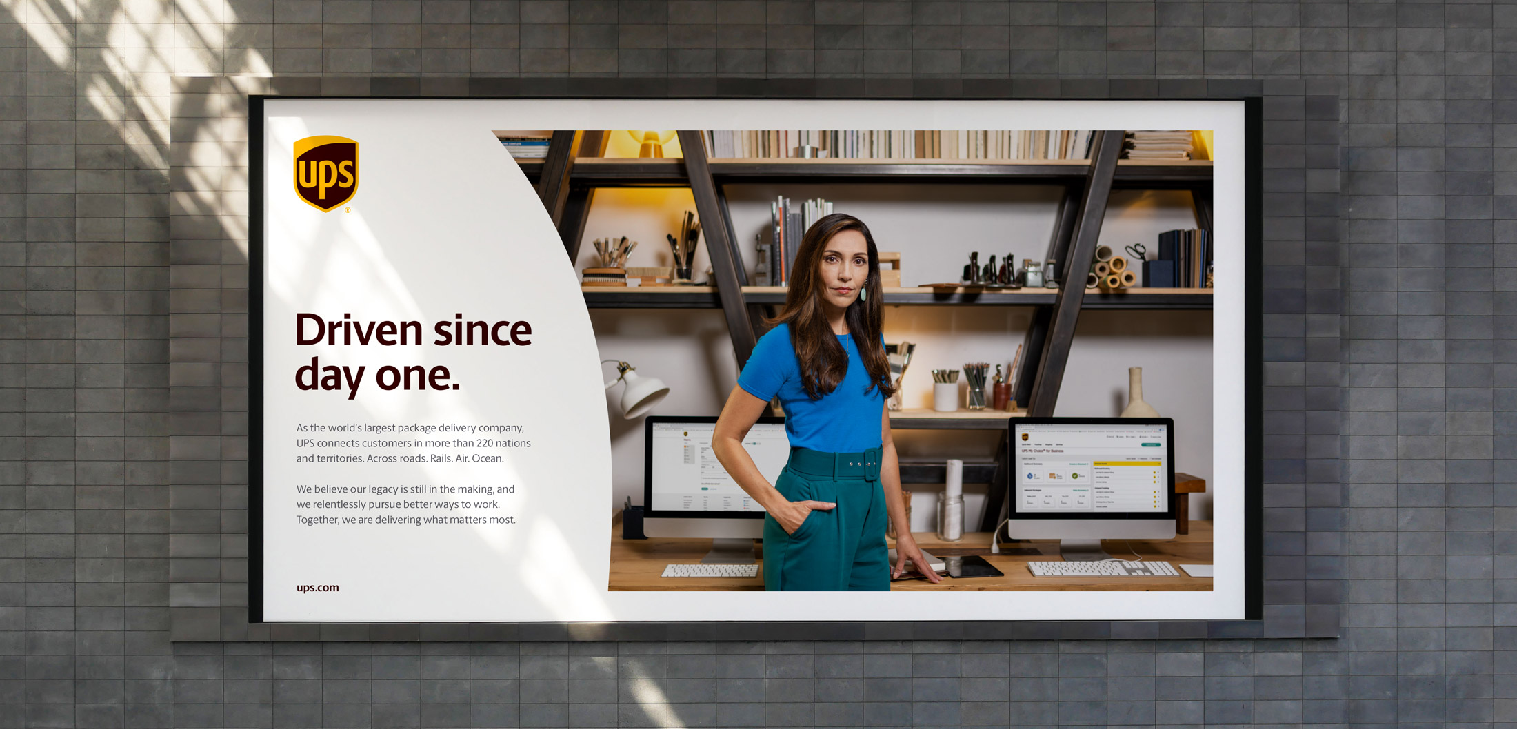
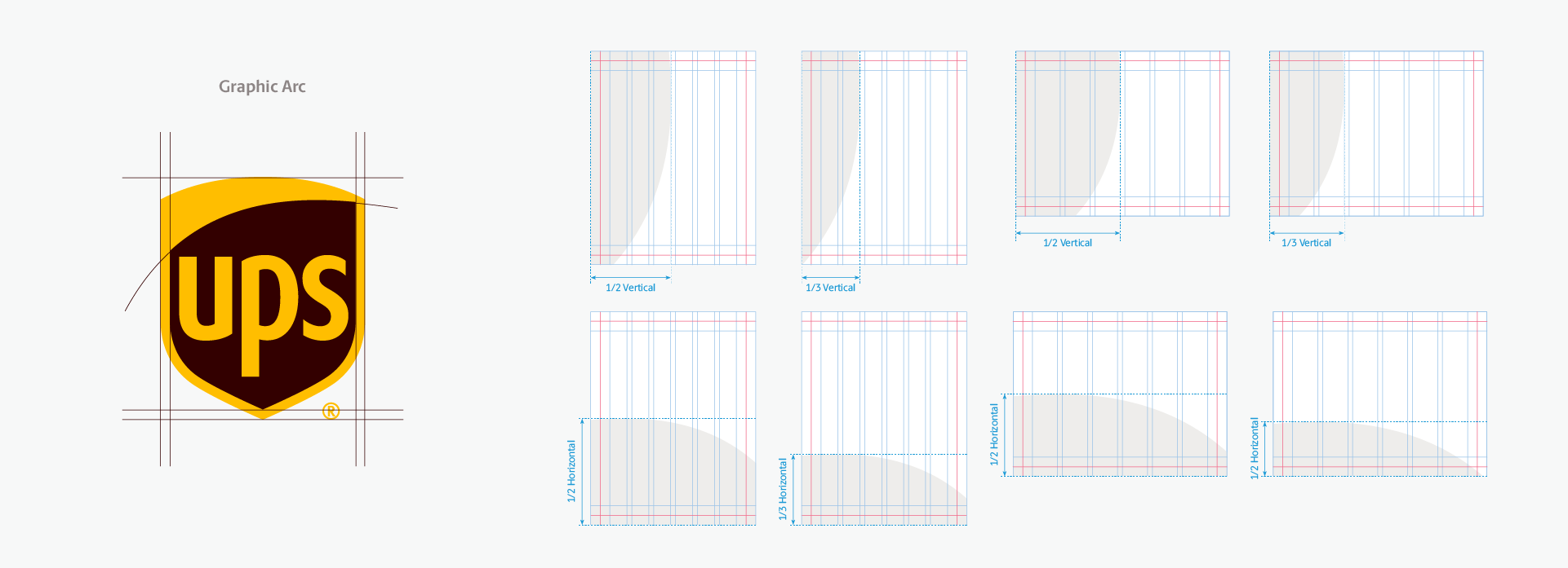
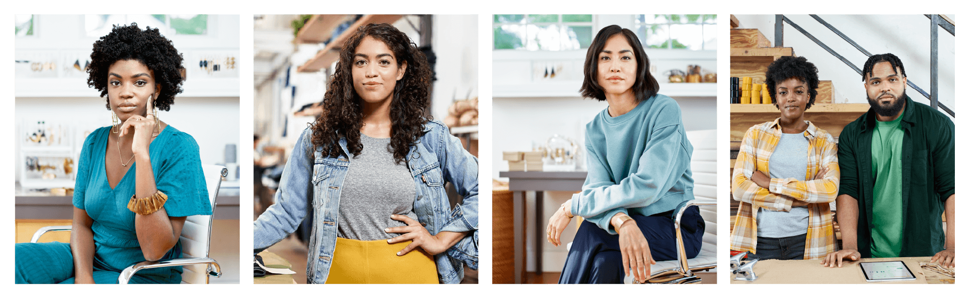
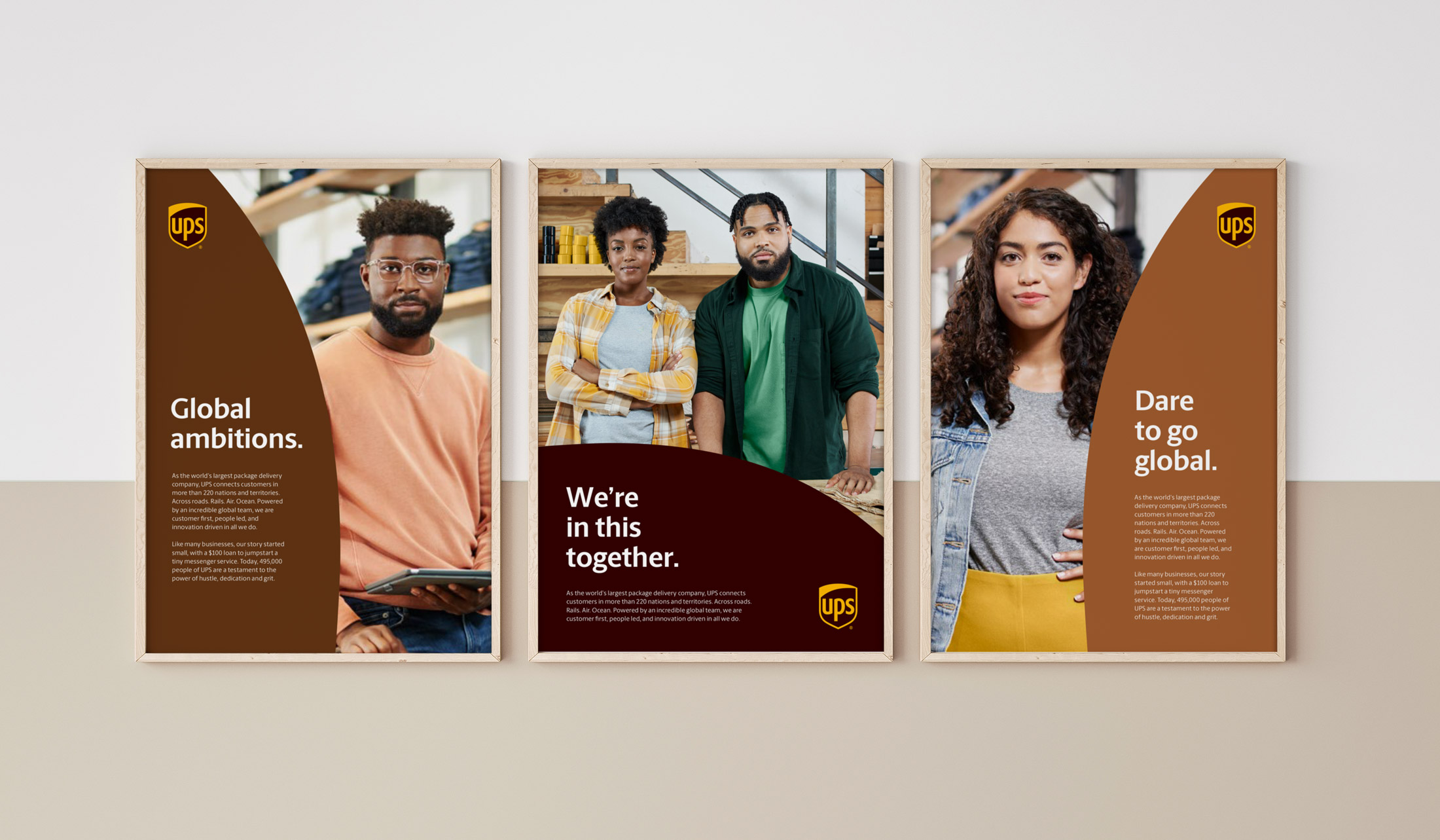
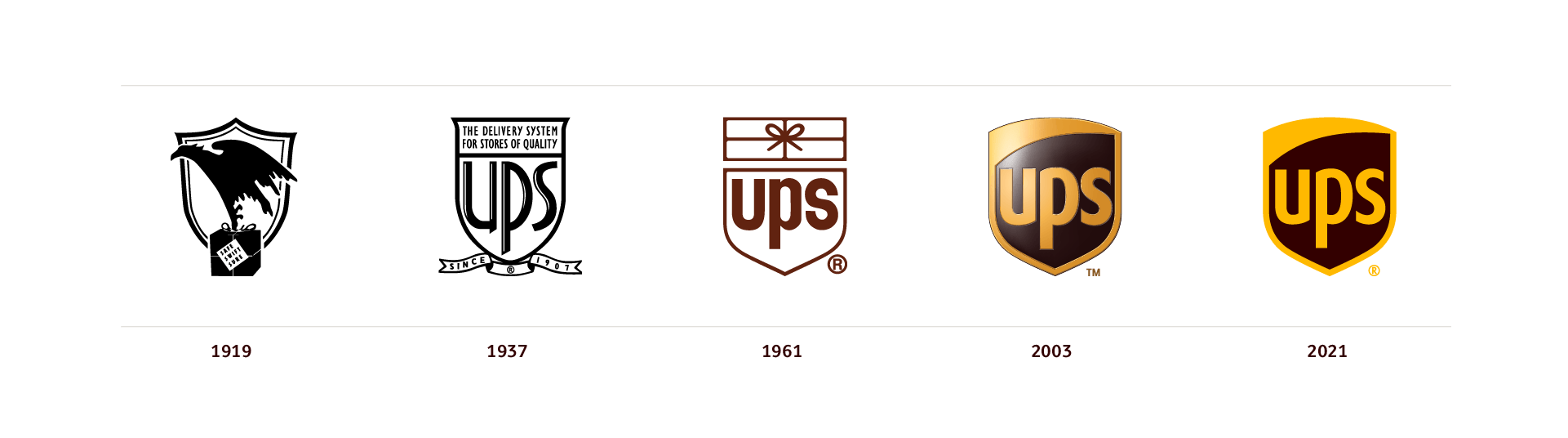
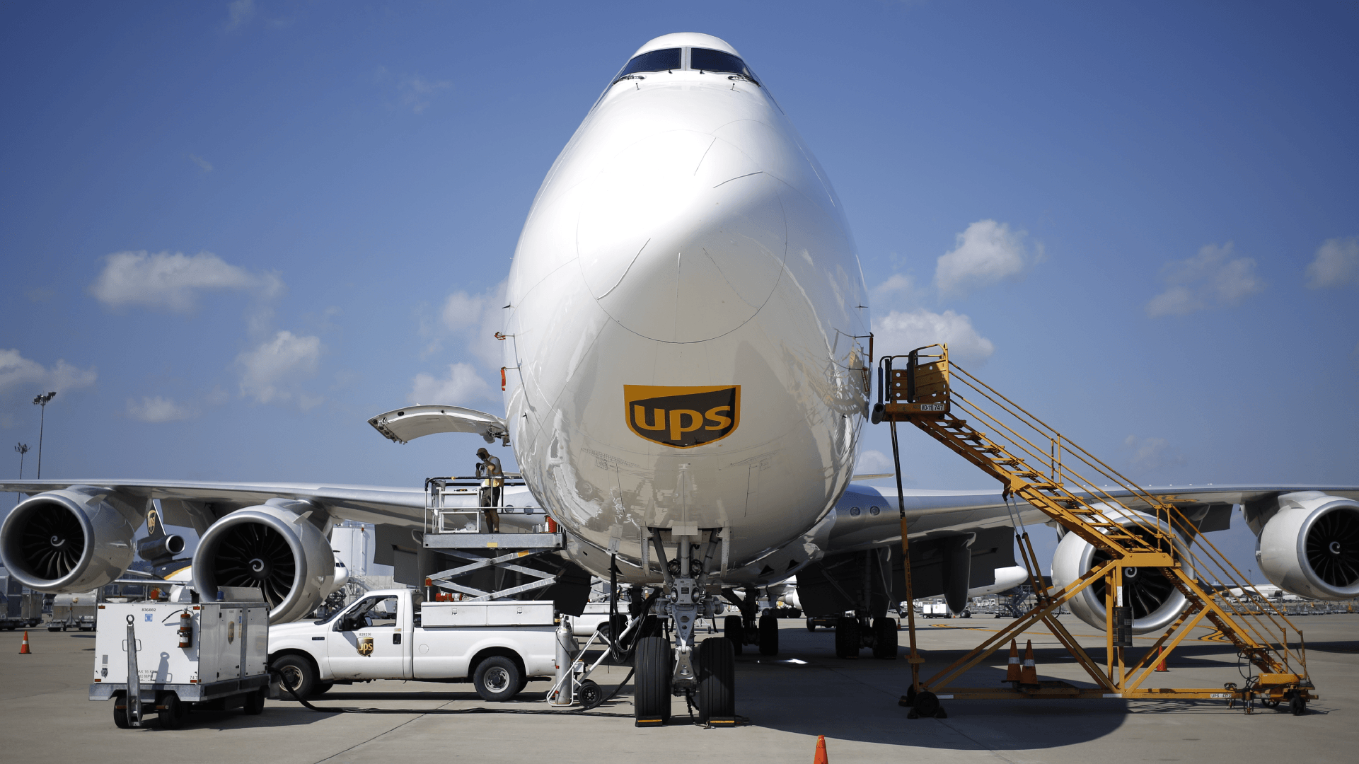
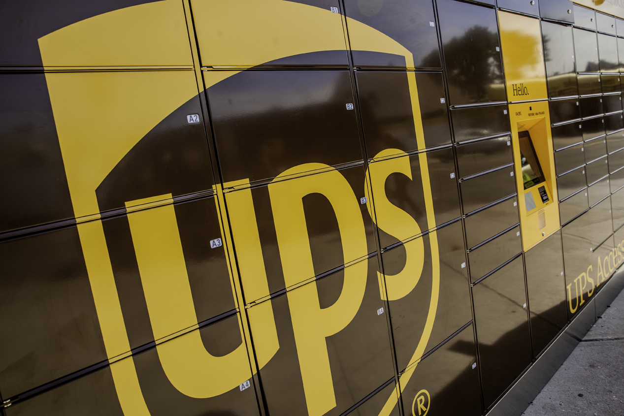
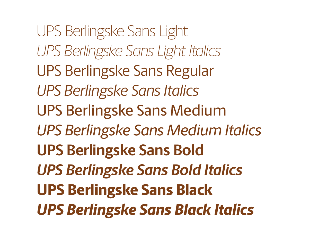
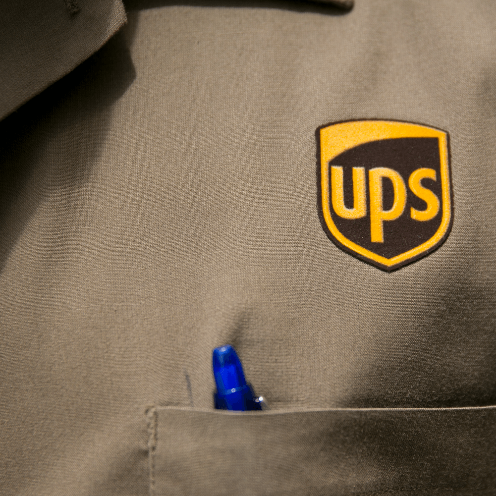
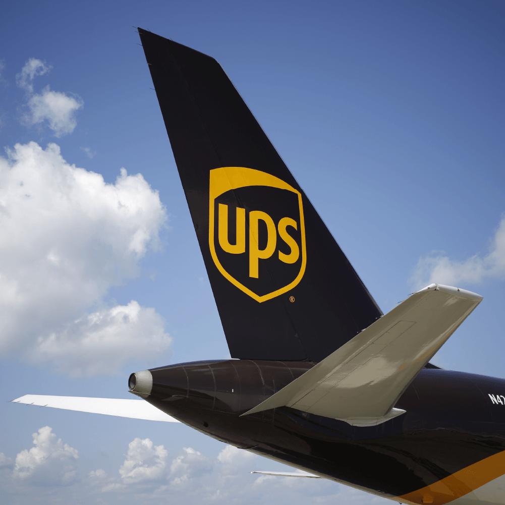
Under our creative direction and guidance, the internal teams at UPS can now start to implement a holistic vision – be it on uniforms, signage, trucks, planes or digital applications. Starting with simplifying the logo down into a 2-color solution and retiring the gradient, UPS is now capable of reproducing their most important asset everywhere. Along with a bold take on color, photography and a new graphic language, we were able to elevate and modernize one of the world's most recognizable brands.
Agency: FutureBrand
Packaging Design: The Martin Agency
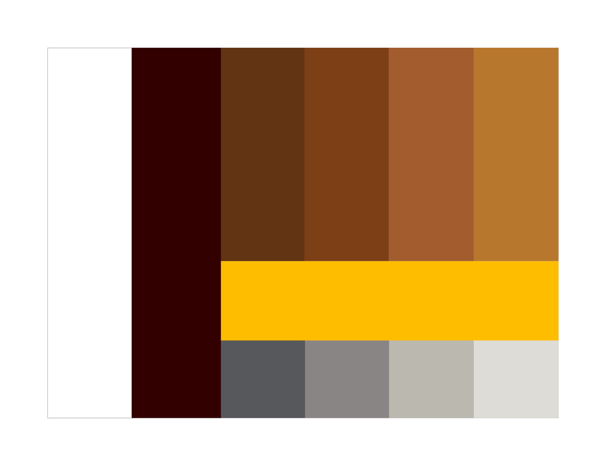

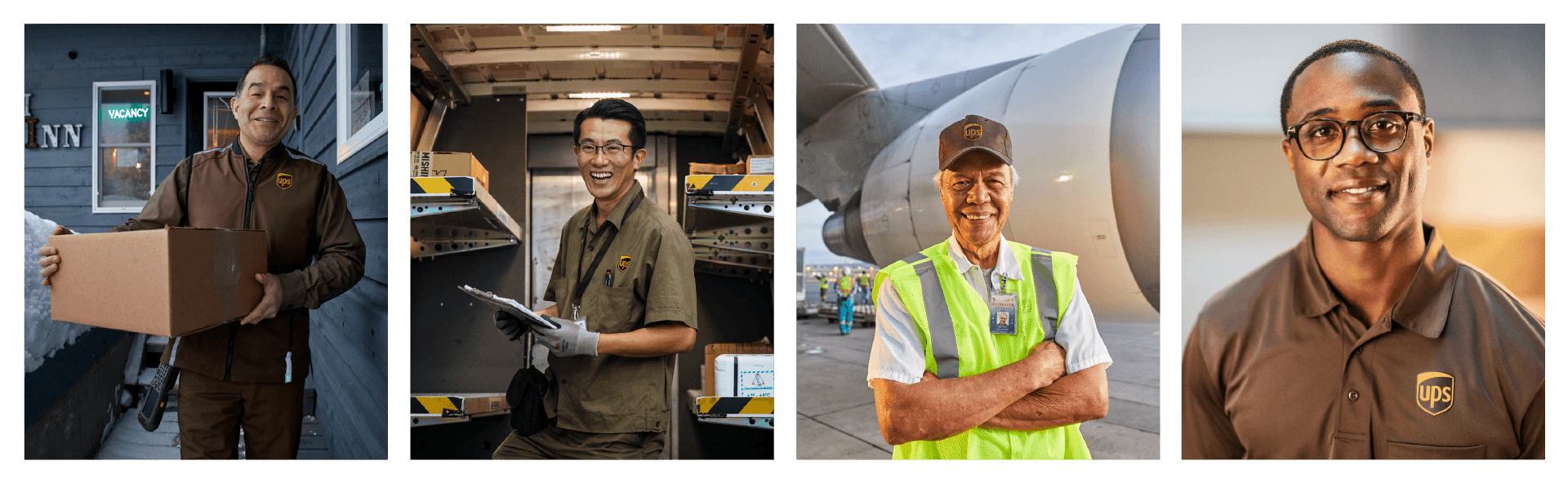
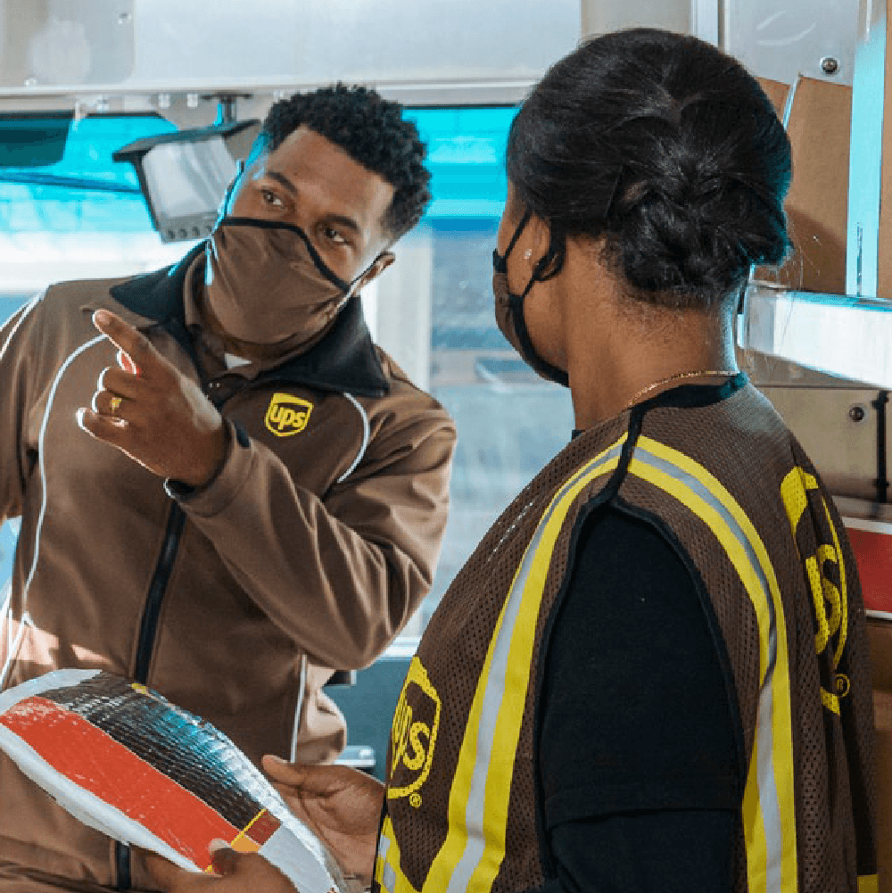
Beyond ensuring that the core brand assets show up consistently across multiple touchpoints, we wanted to celebrate the small business owners and end-customers who rely on UPS with that same energy and spirit. Brown doesn't have to feel limiting from a creative standpoint – instead, it's a just a foundation to build from. With a flexible grid system inspired by the shield itself, UPS now has the ability to create communication materials to fit a multitude of needs and requirements.