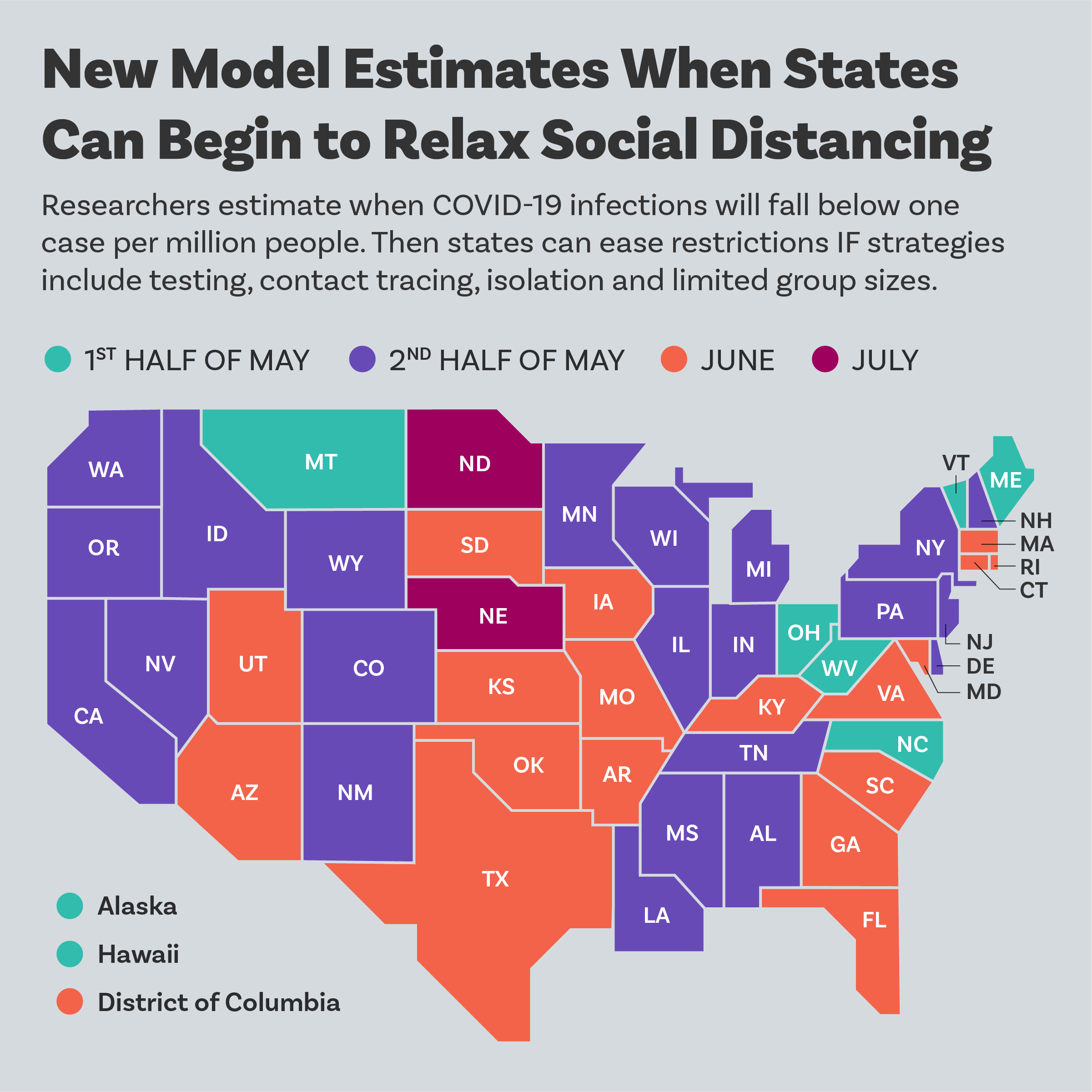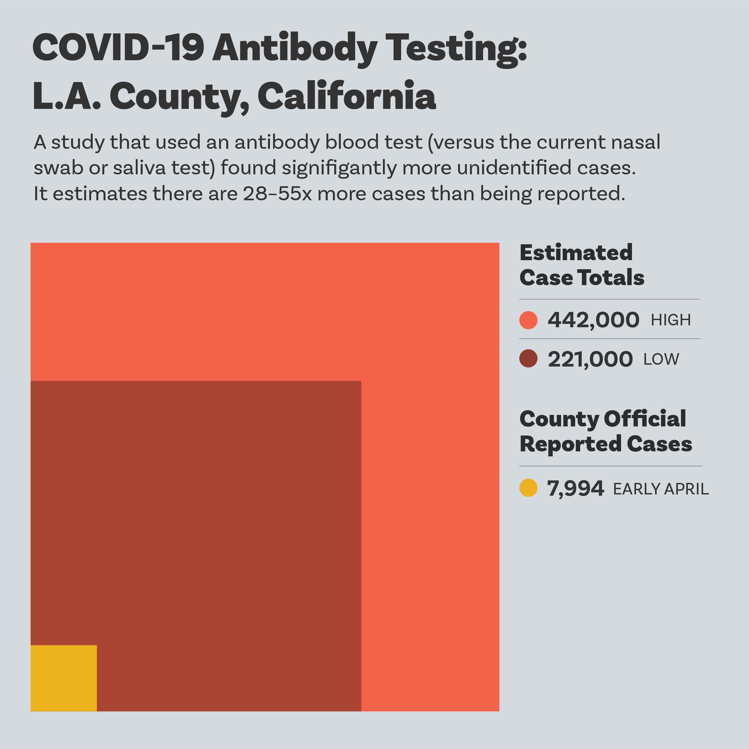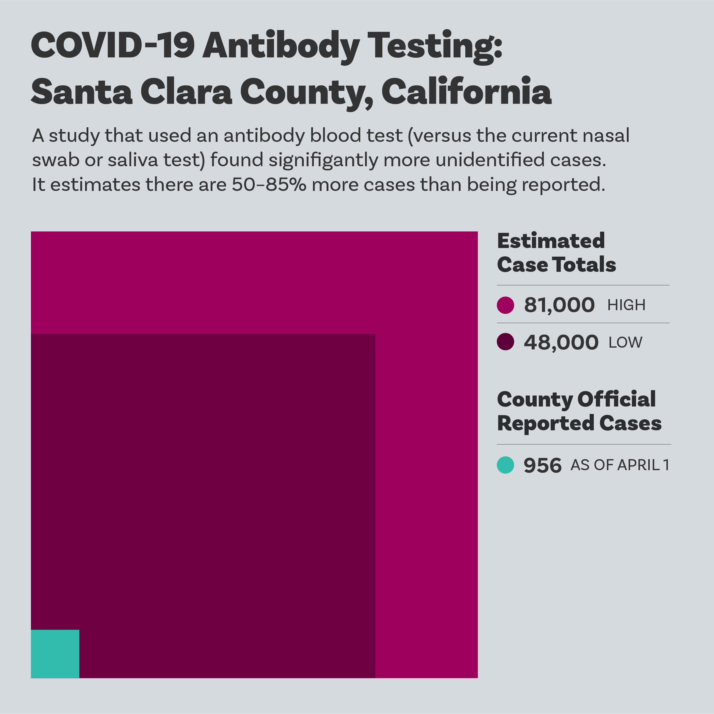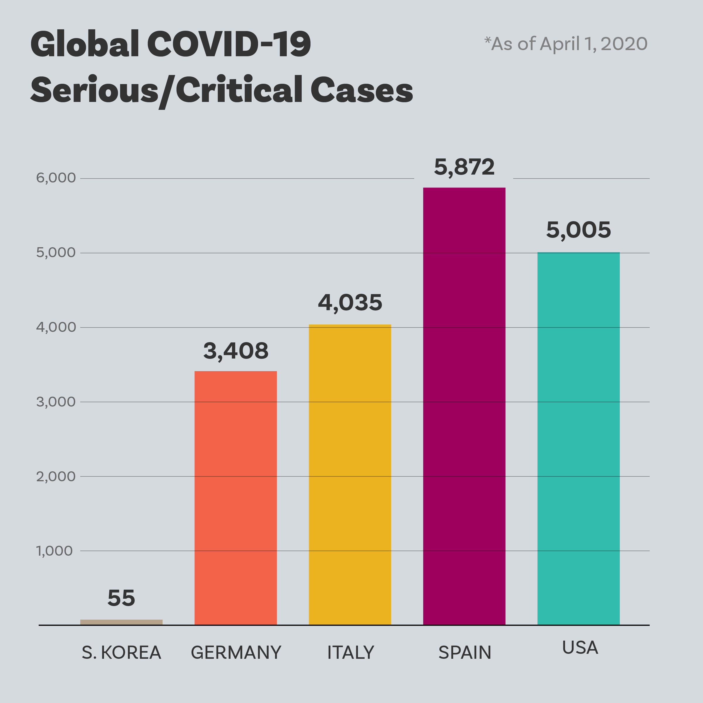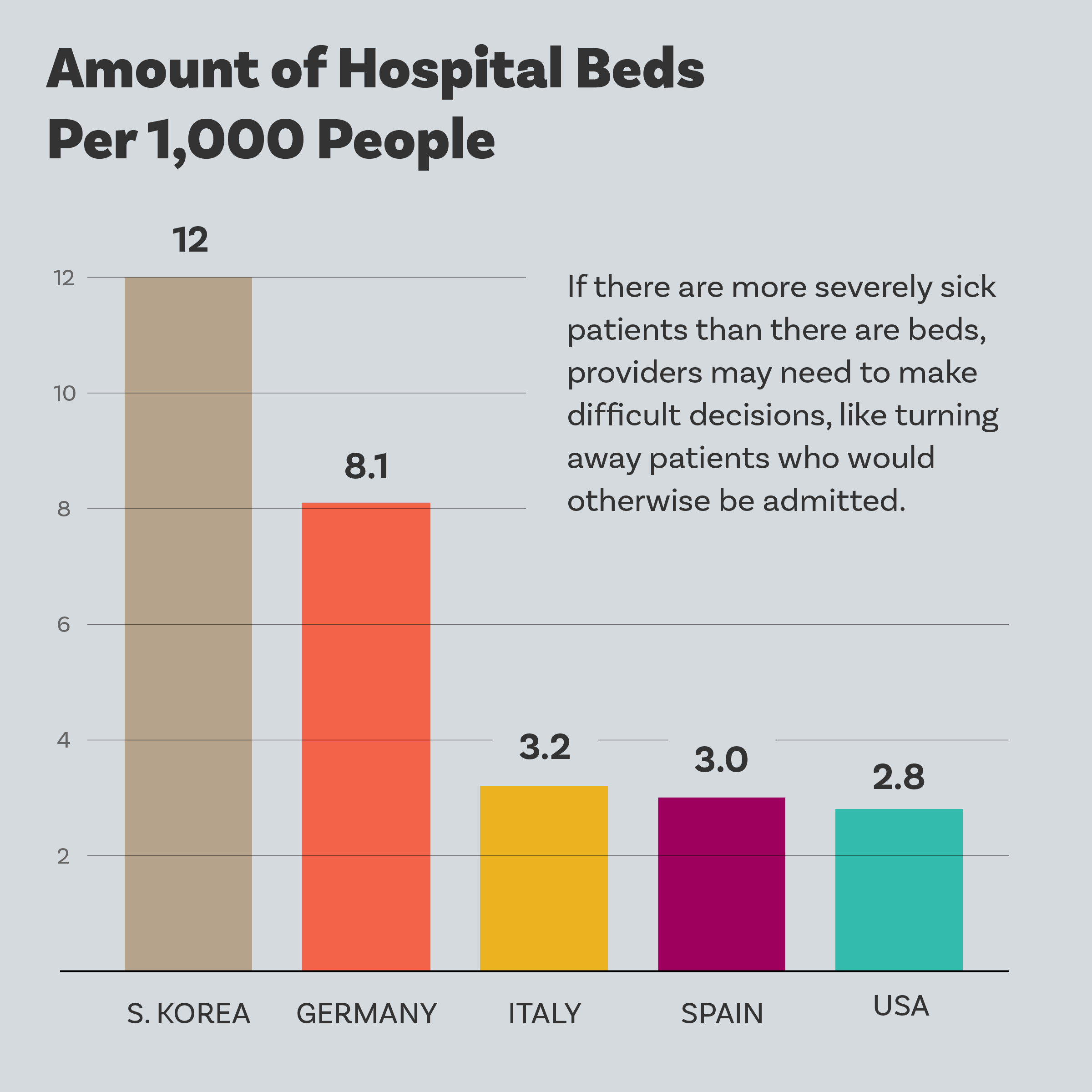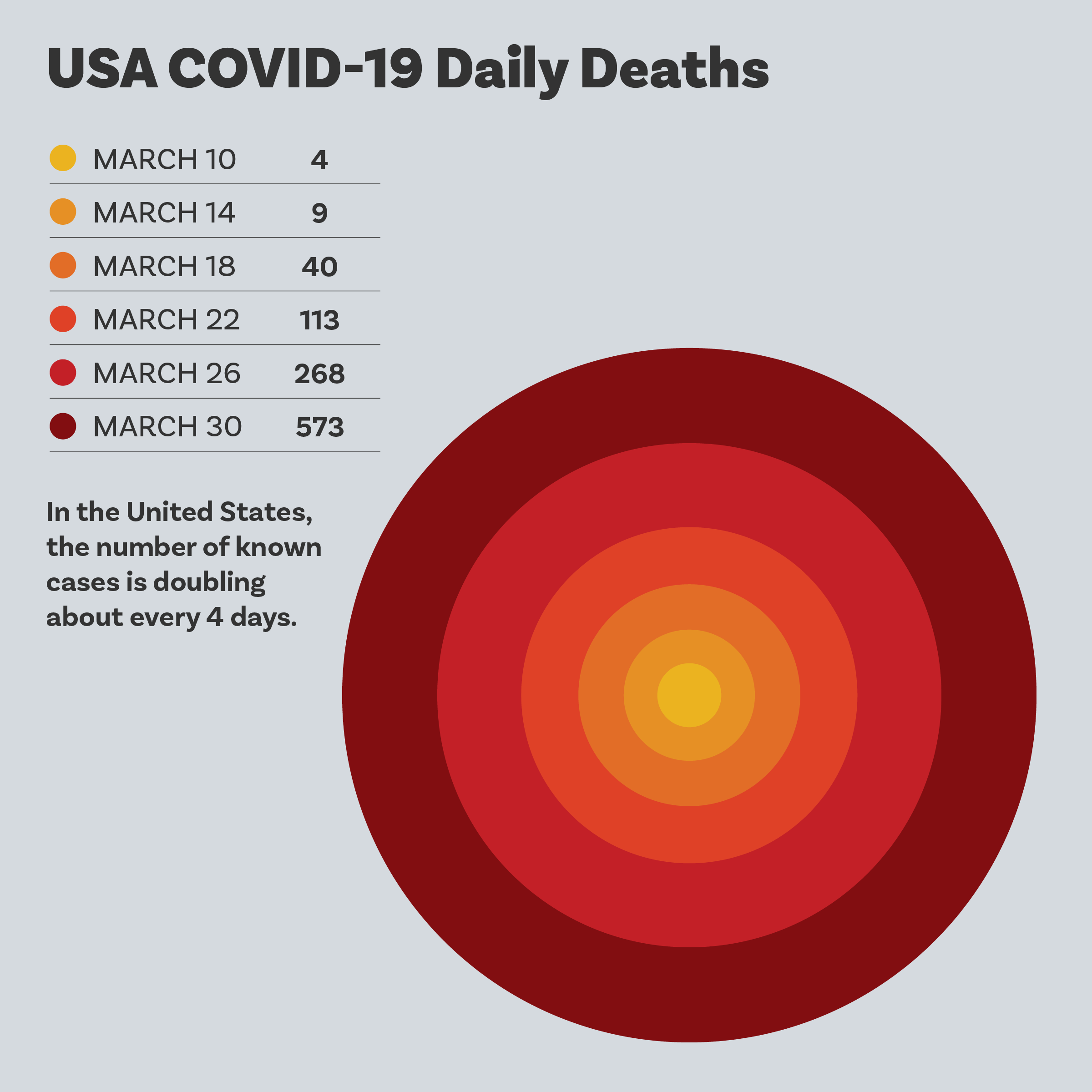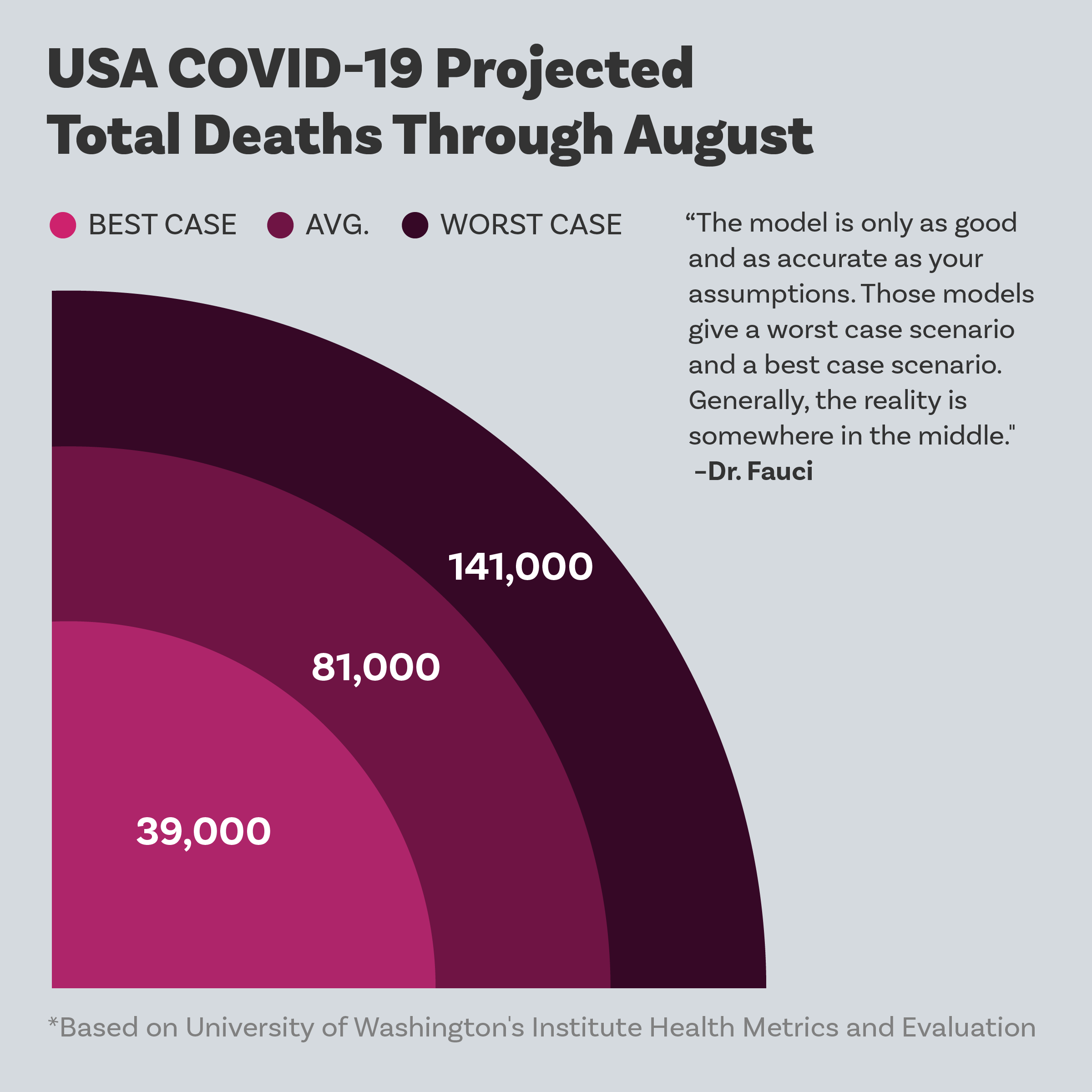


Visualizing the global impact of COVID-19
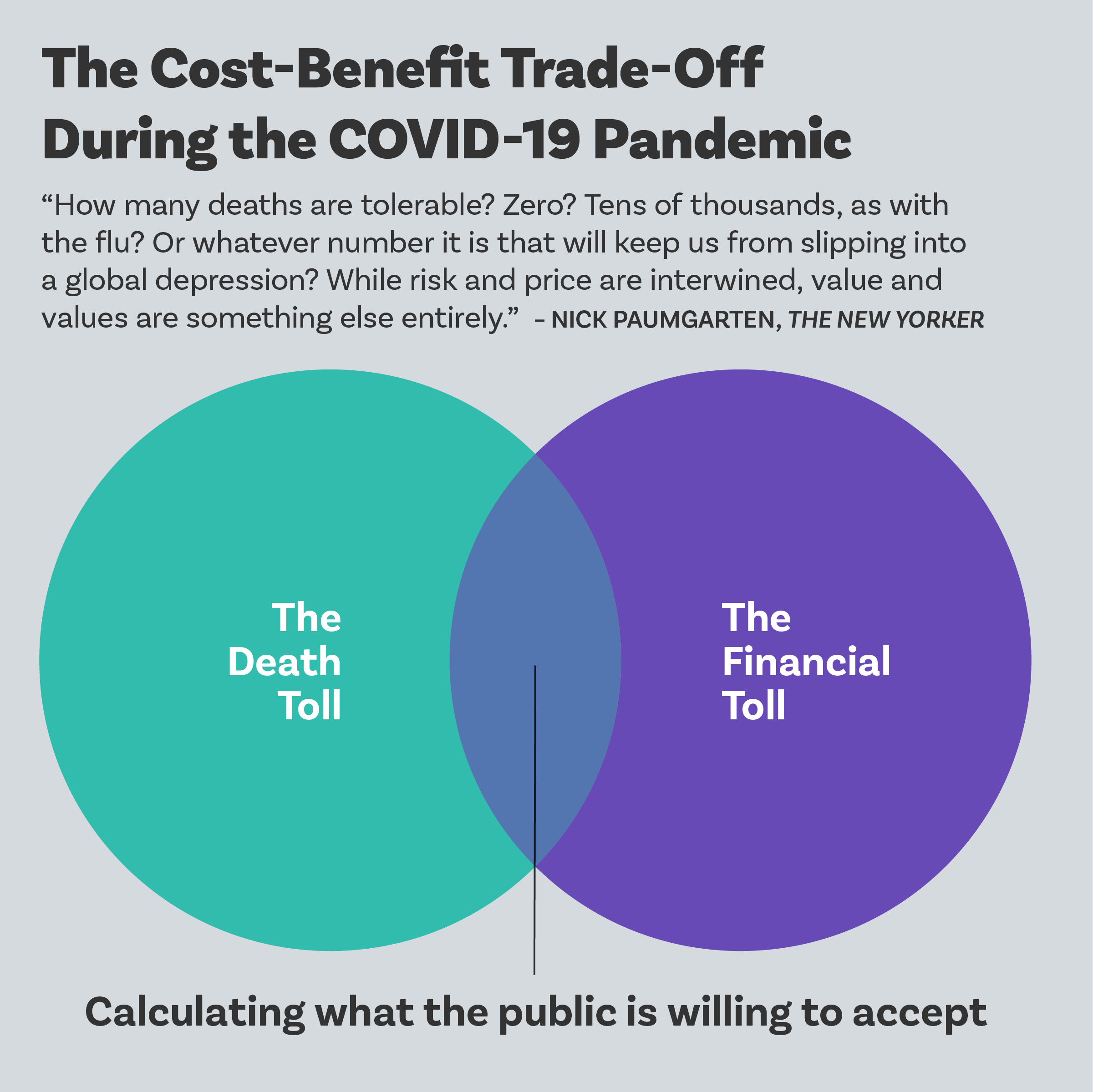
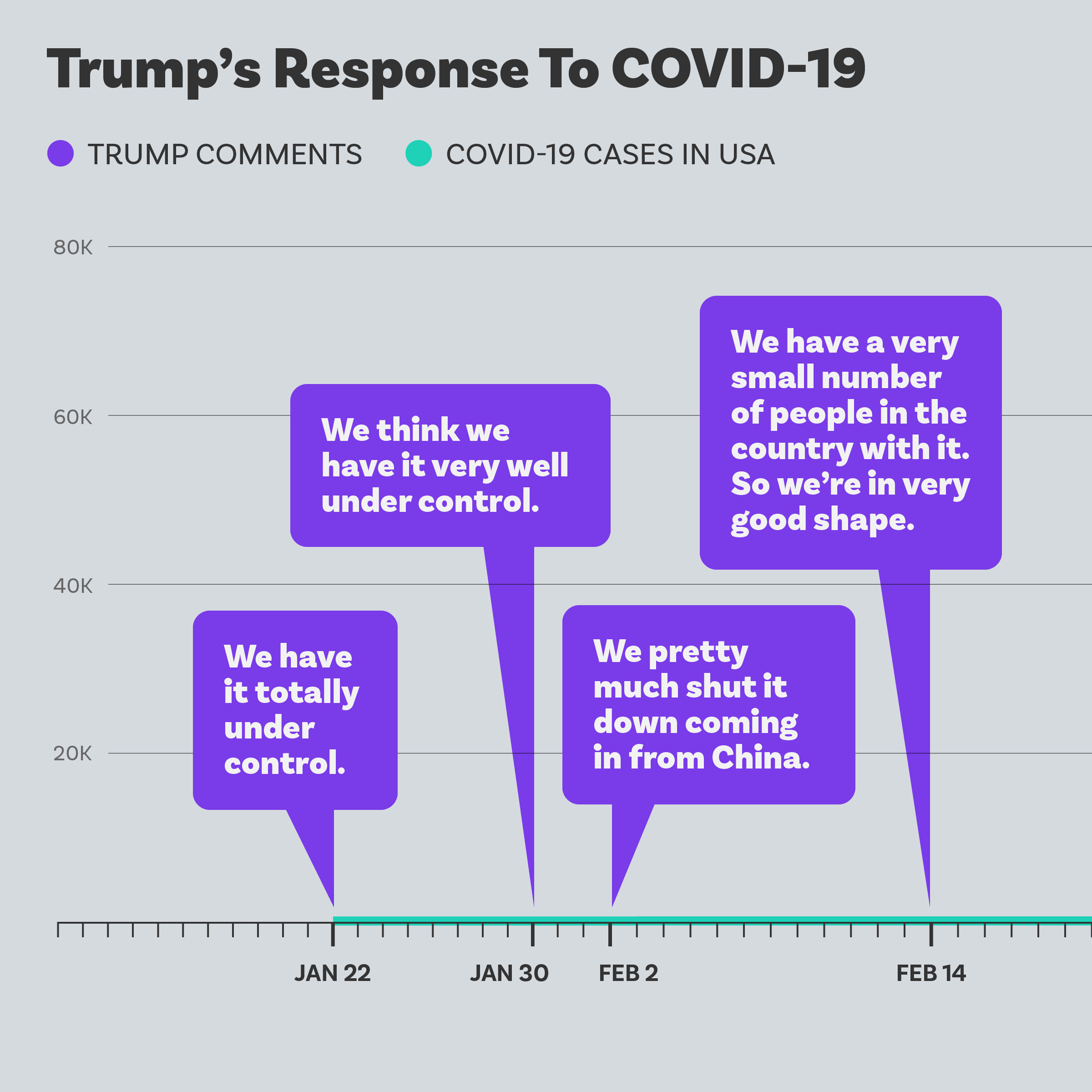
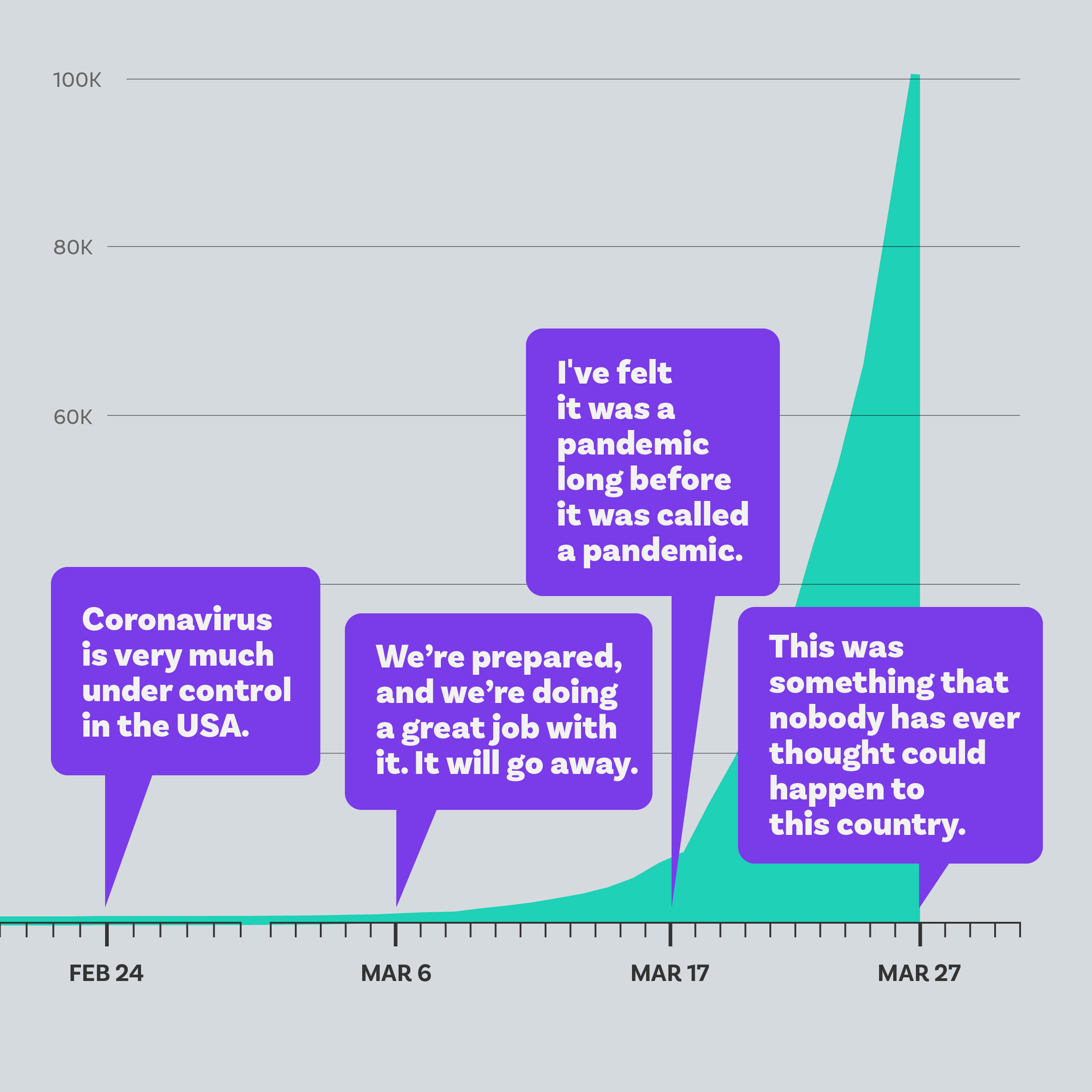
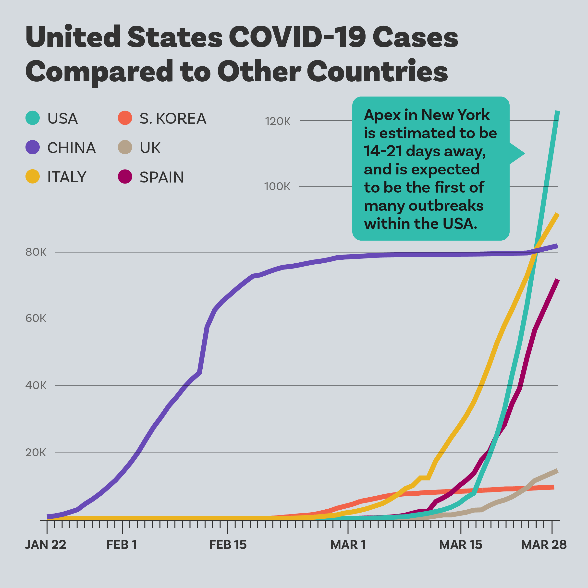
COVID-19’s spread took the world by storm, and the news cycle frantically scrambled to keep pace. For many of us, the shifting stories resulted in information overload. The goal of this project? To cut through the clutter and help people see the impact of this crisis and engage with the data in a meaningful way.
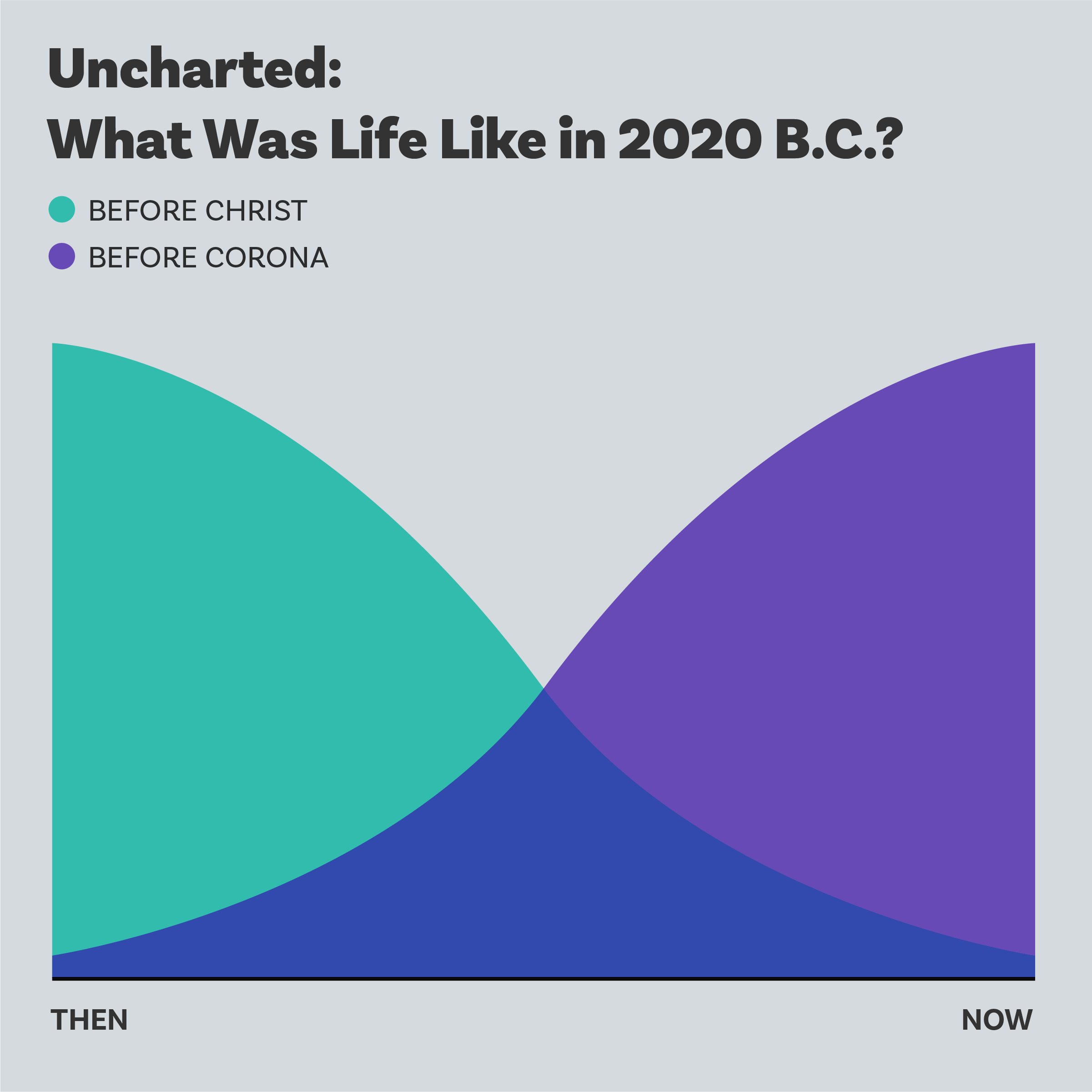
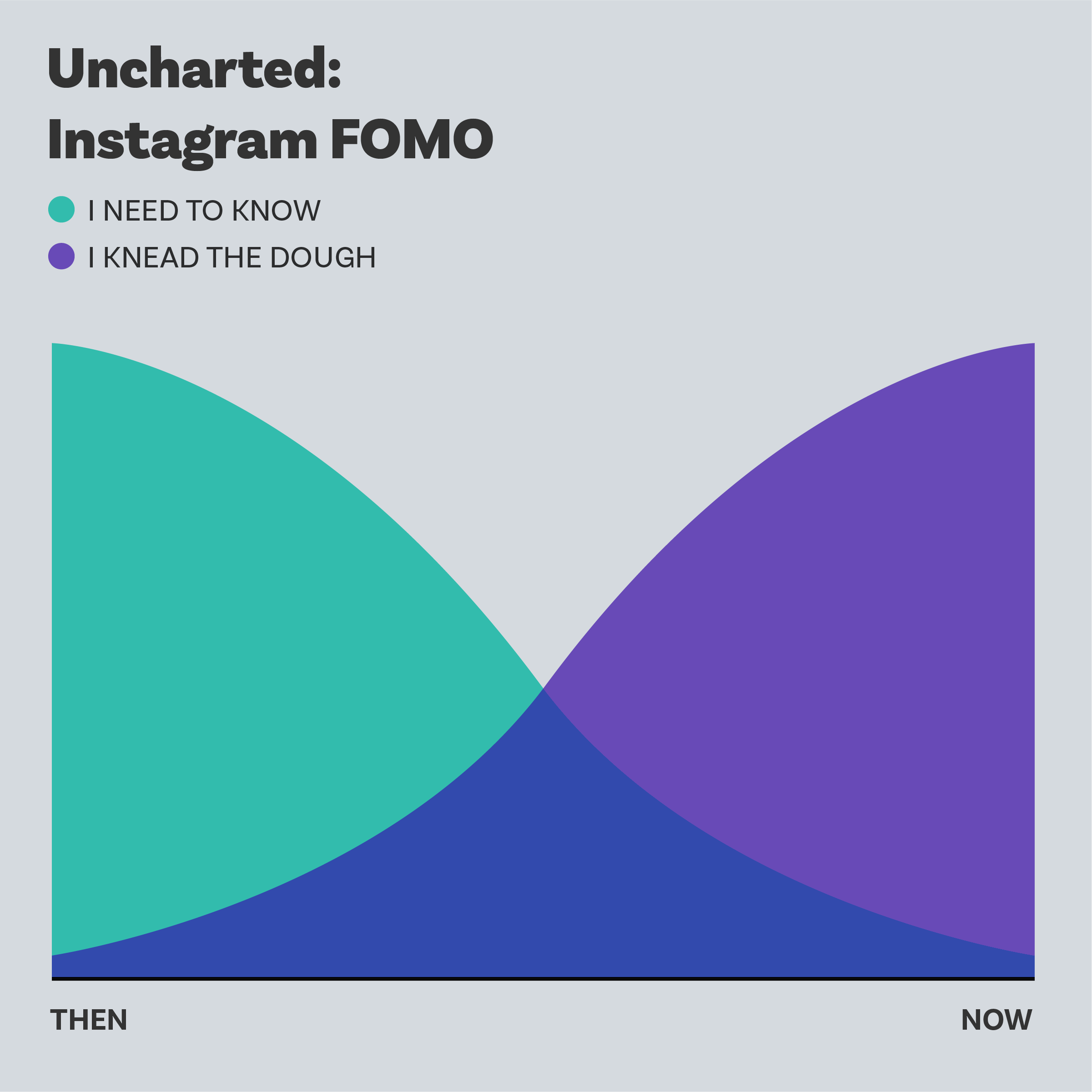
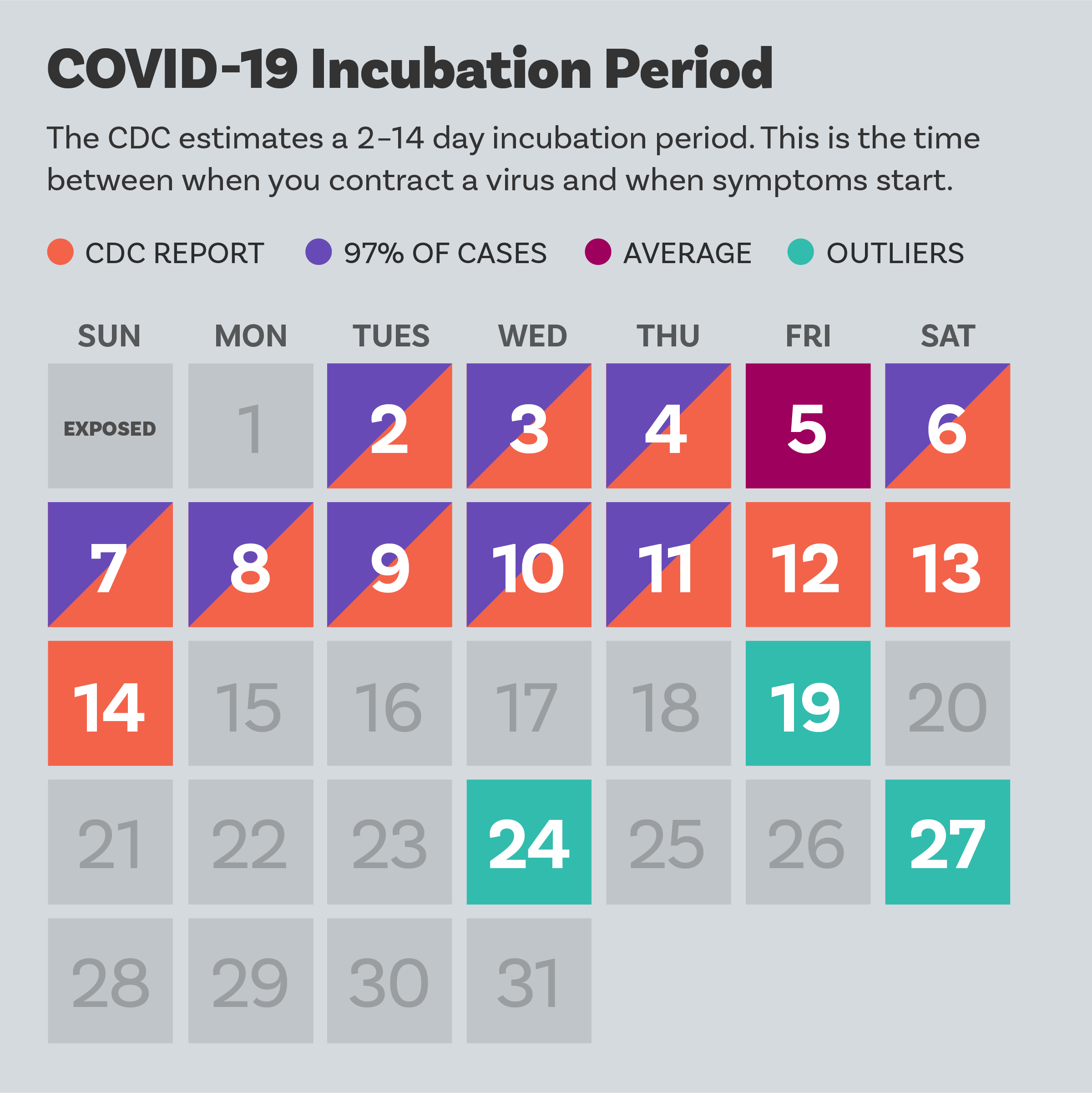
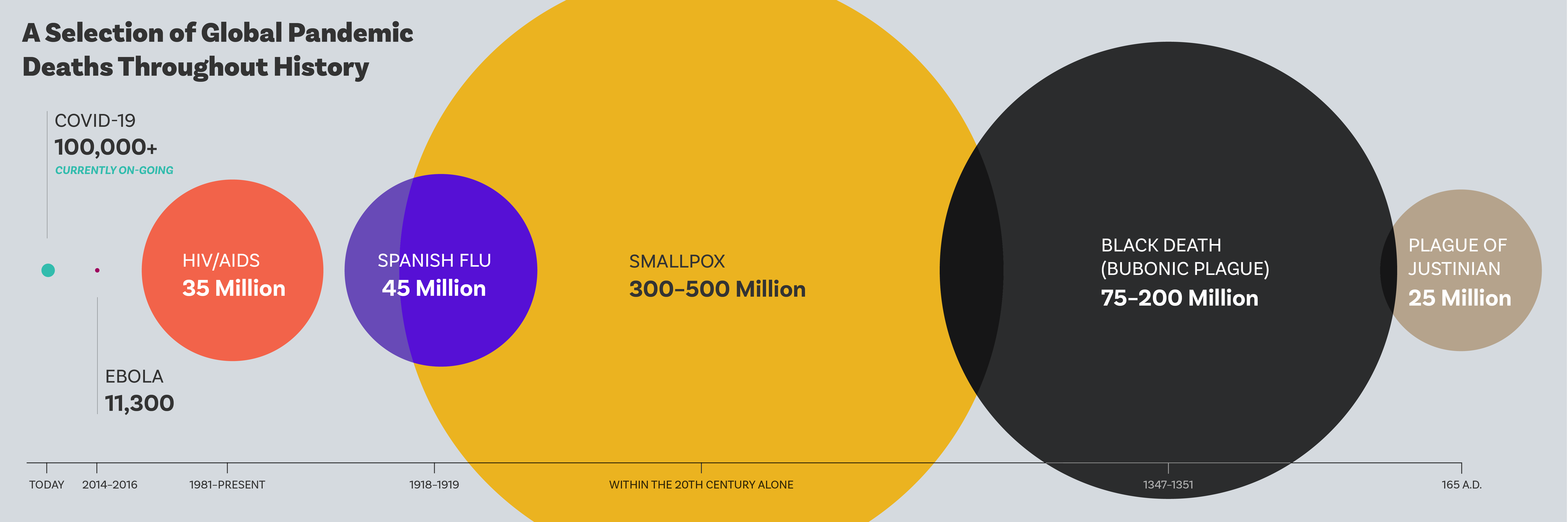
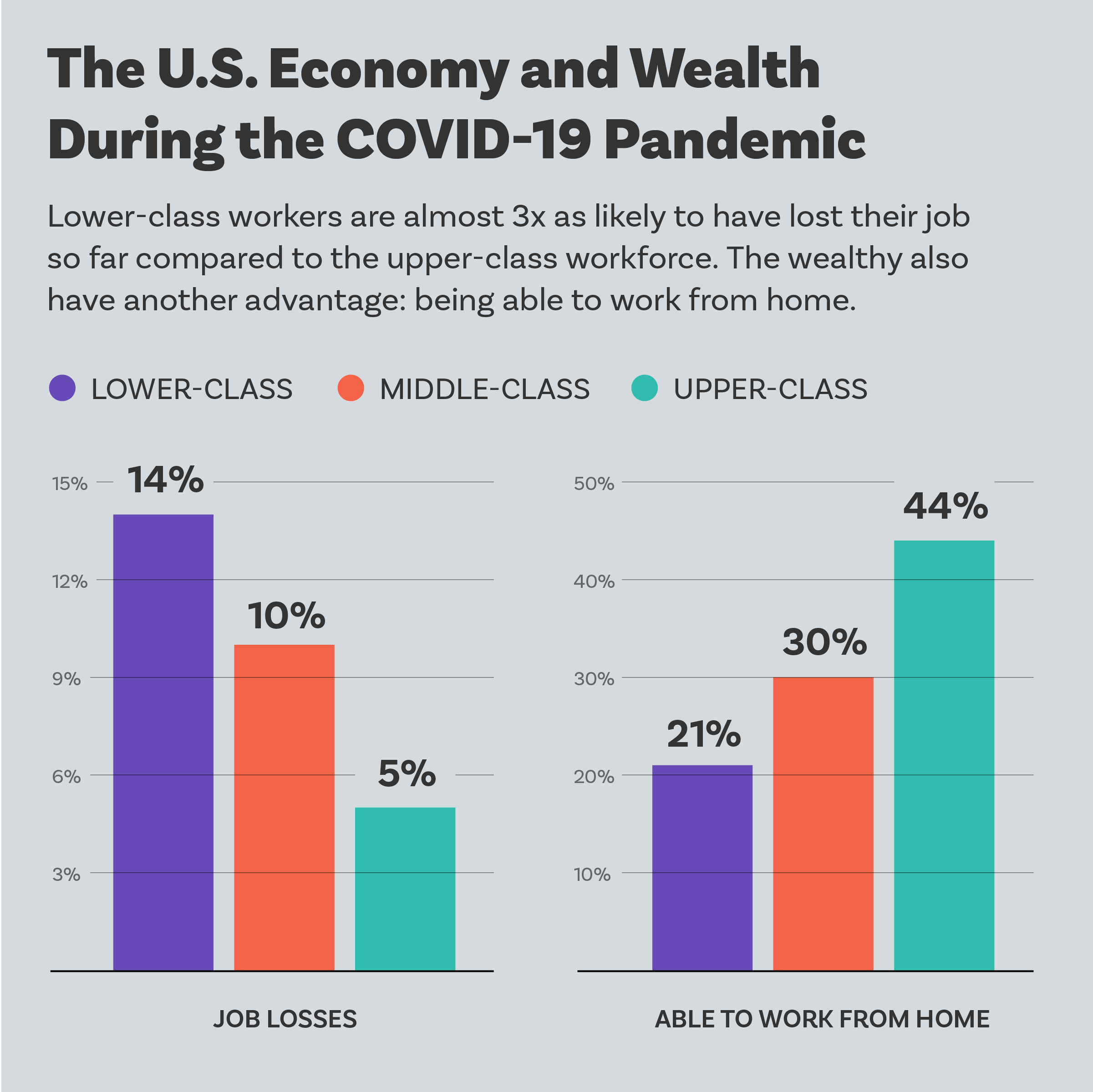
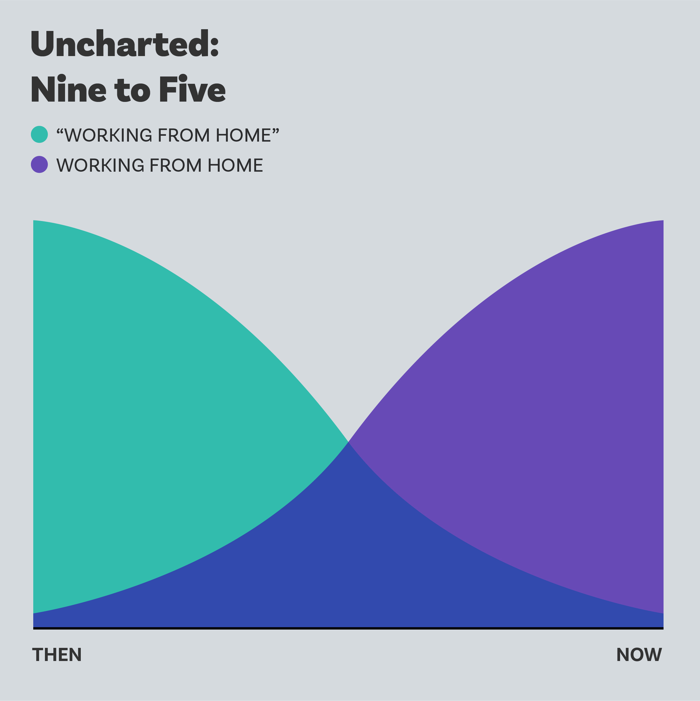
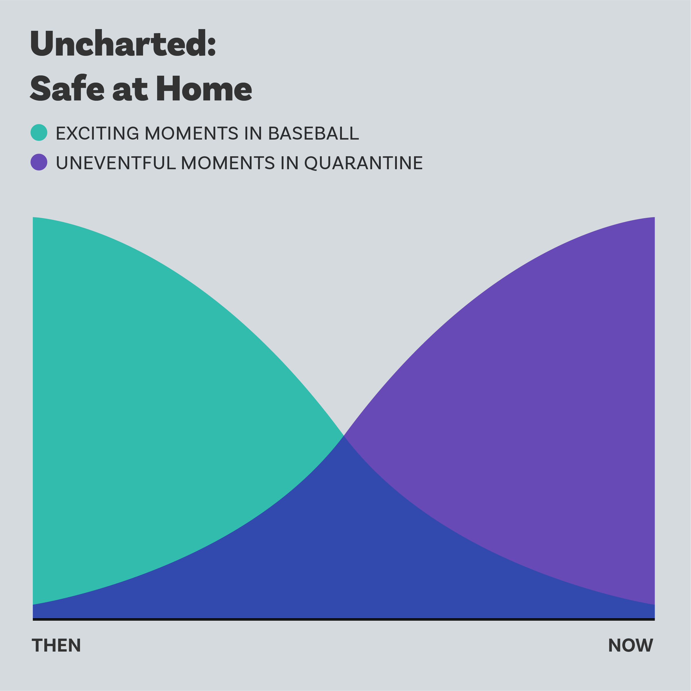
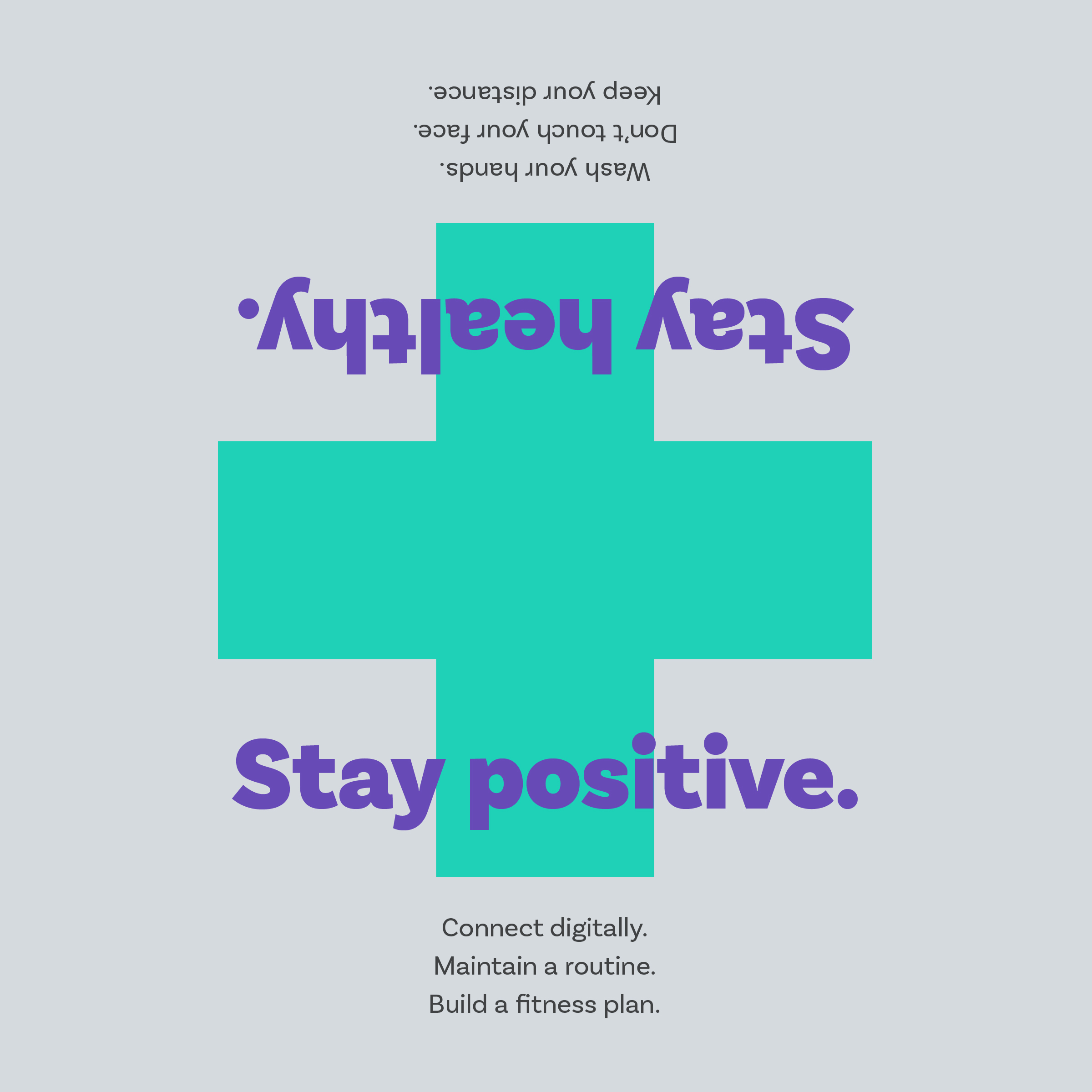
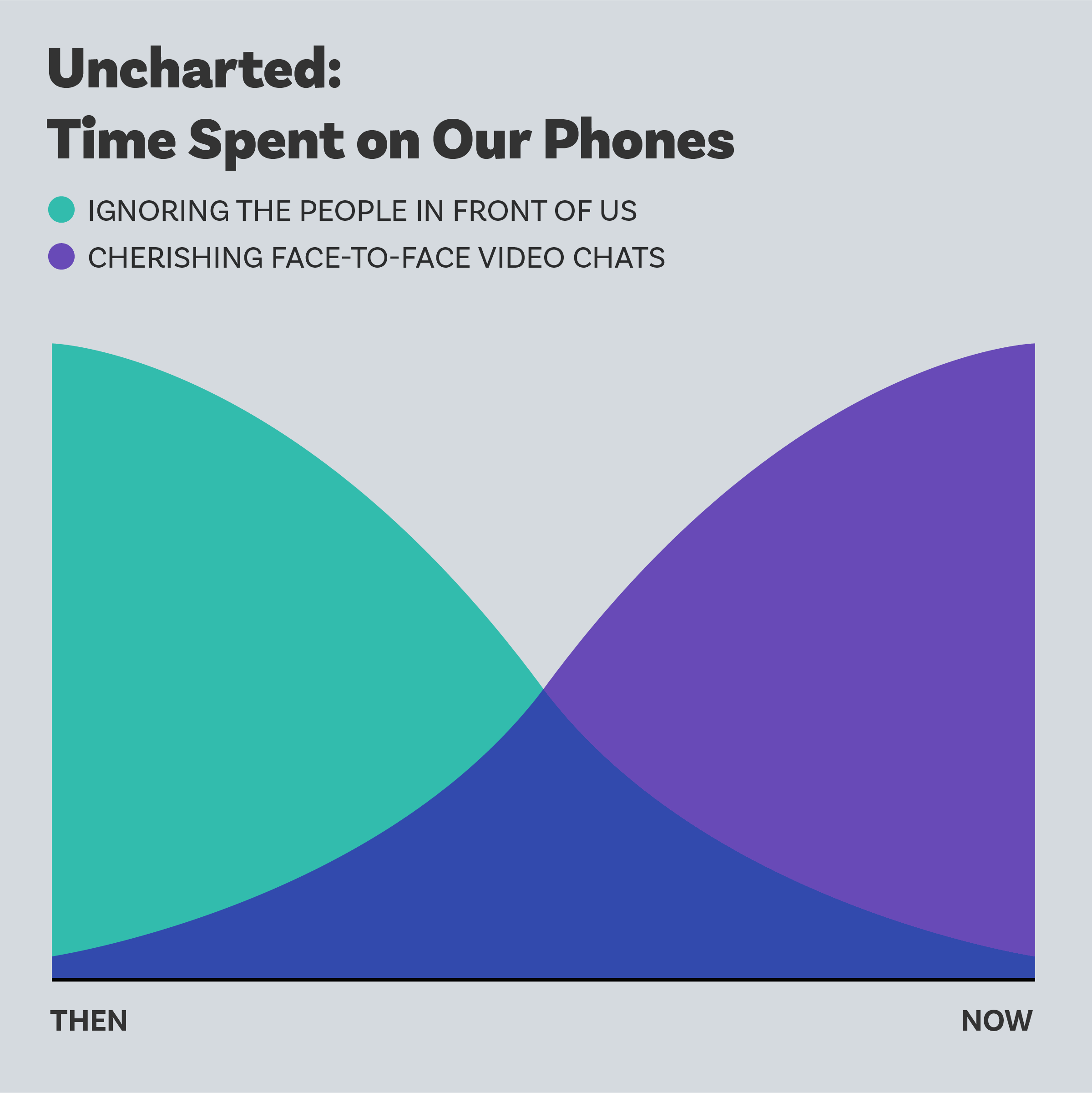
To sum up, I tried to visualize news headlines that could ground the viewer in enough context to understand the data. Hopefully with that knowledge, they could then go off and learn more about the ever-evolving stories that were taking place. Using Instagram, I was constrained by the size and limitations the platform provided – however, I found that useful in presenting a consistent, clear and simple graphic every day, from the end of March to the middle of May, 2020. As the project evolved, I added in moments of respite – fun PSA announcements, as well as a series of light-hearted philosophical moments titled "Uncharted."